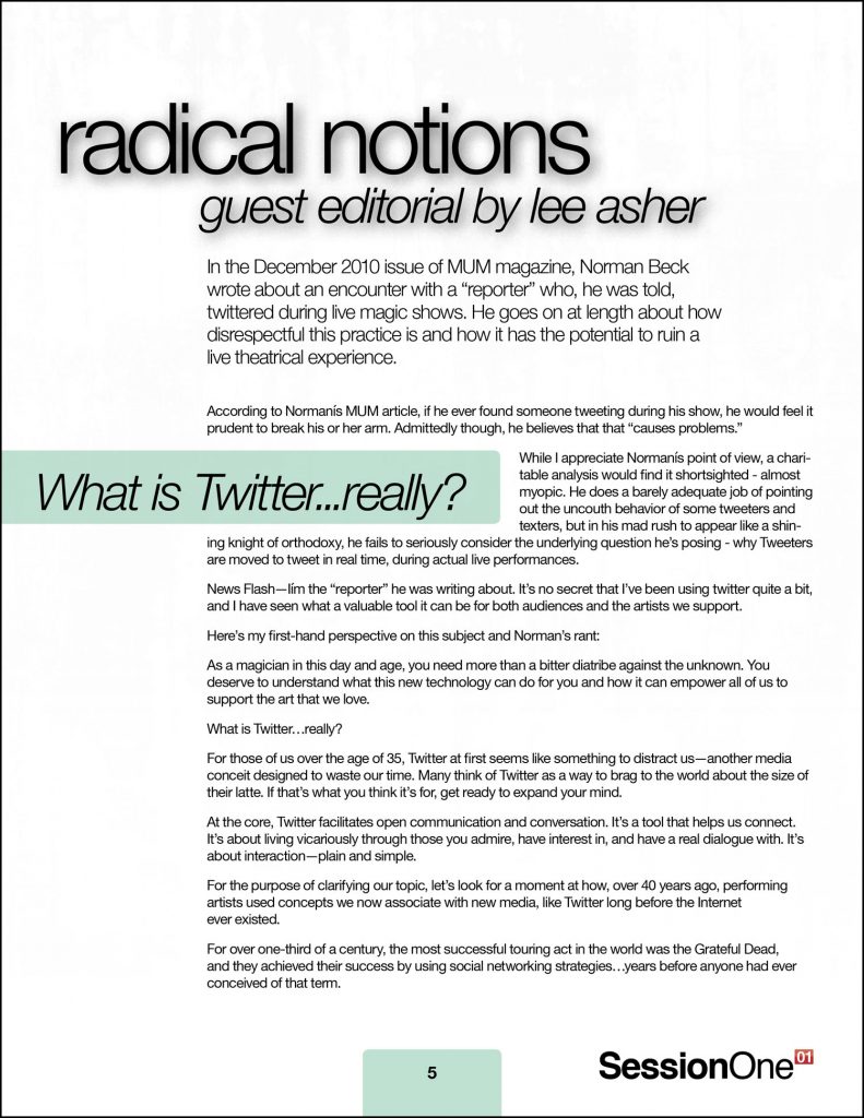
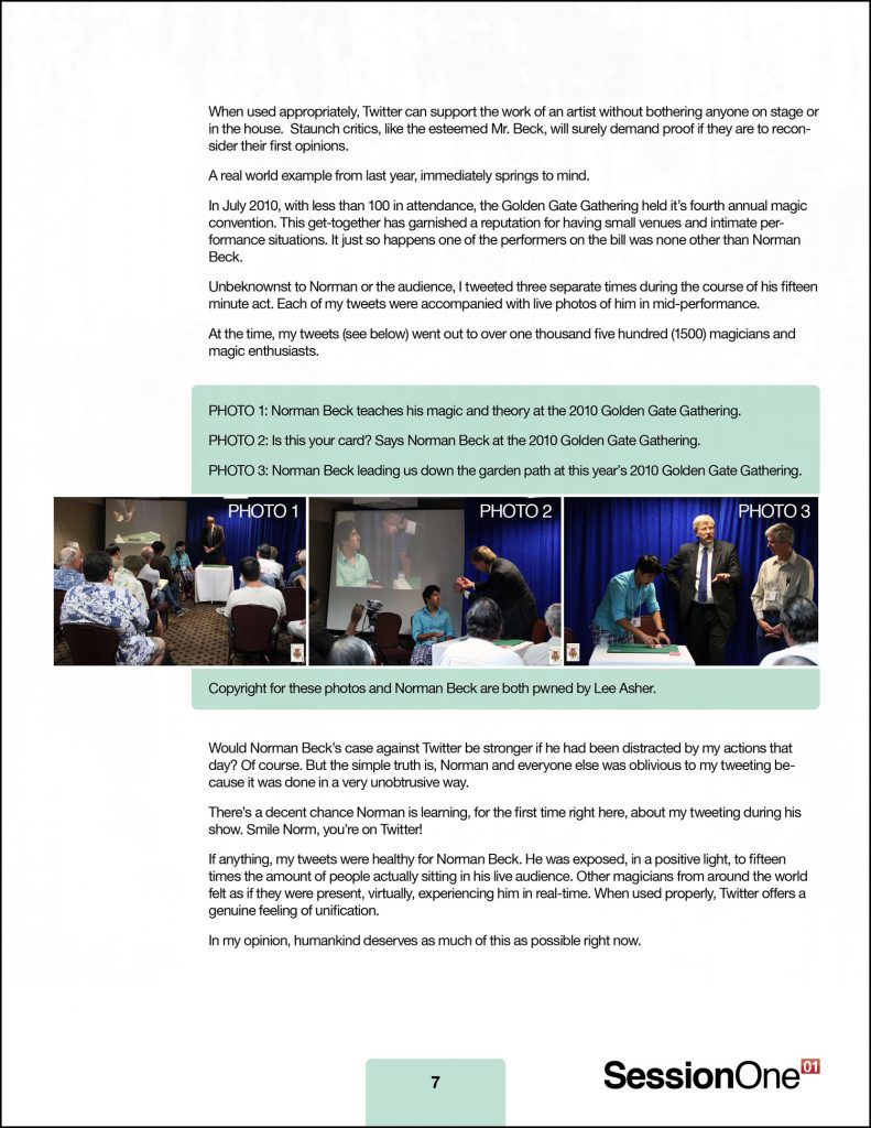
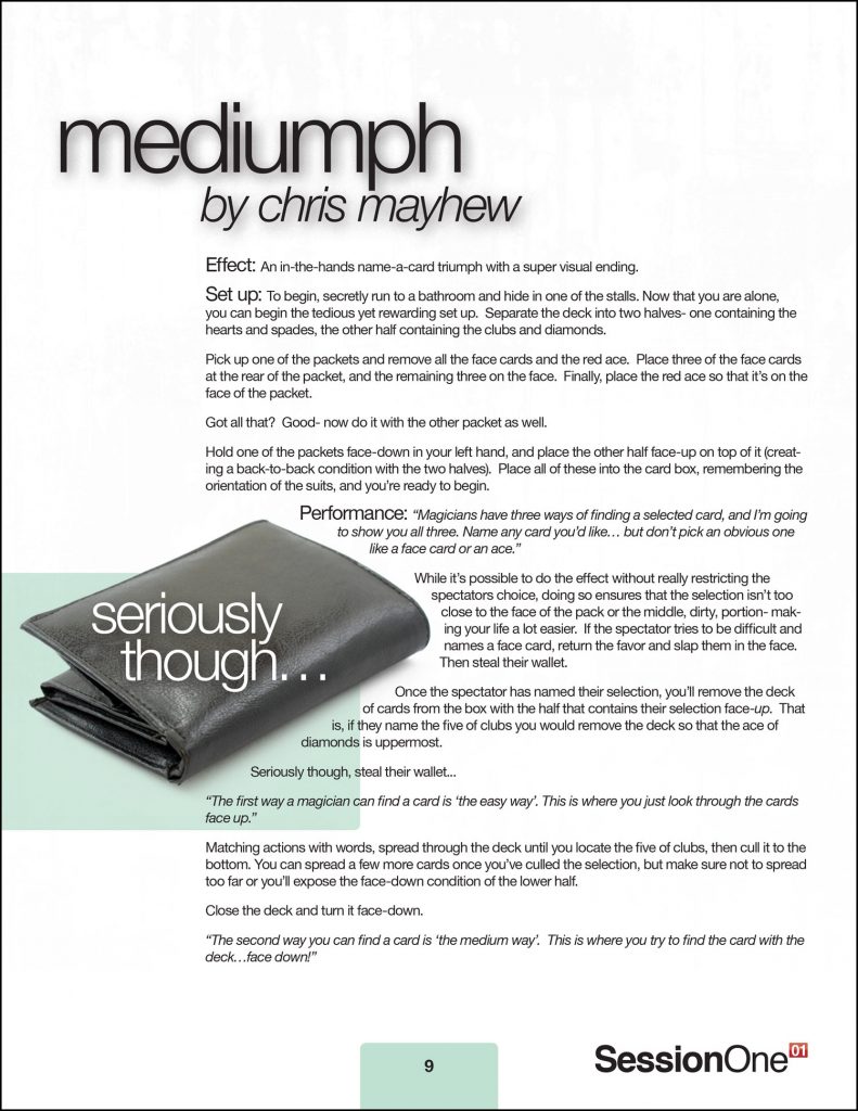
I was commissioned to layout a limited edition digital magic magazine. Previously the client had me design the cover for a past issue, but after seeing what the inside looked like compared to the cover, they wanted me to redesign the entire document so it all looked professionally done. Here are some pages from the final result.

The cover is rather abstract and a little edgy with the circles denoting linking rings and the whole design sort of giving off an underground, exclusive feeling.
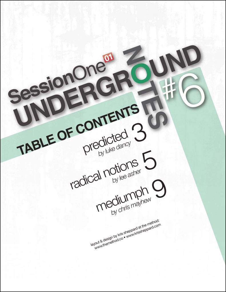
The Table of Contents page takes the rotated title treatment and is built around that.
