I’ve been working with a local produce box delivery company doing various design and back end store management services. For the storefront we use a wonderful service called Barn2Door which specifically serves farms and similar businesses. They’re still new to the game, which means they’re constantly working to improve their product and service for both their clients and their customers.
One feature that I’ve found missing in their Client Portal is where to find data on how promos are performing. As of right now, this information can most easily be found within the data you get when you download customer info. Of course, this is info that should be easily found and displayed within the Promos Tab, especially considering that promos are most often used as a way to help bring in more customers. Knowing which promos perform the best helps companies know where to focus more effort and attention. This is what the promos tab currently looks like.
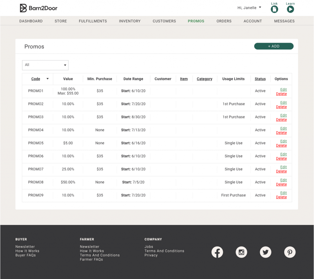
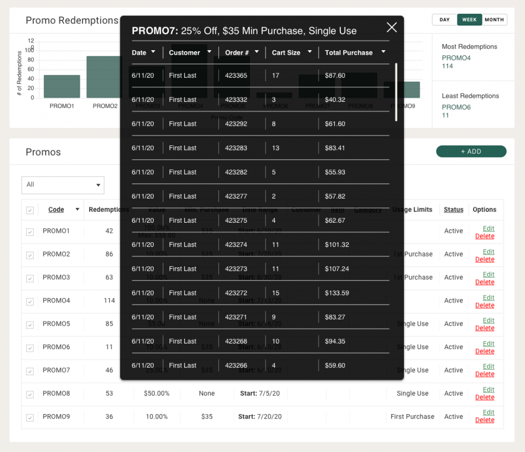
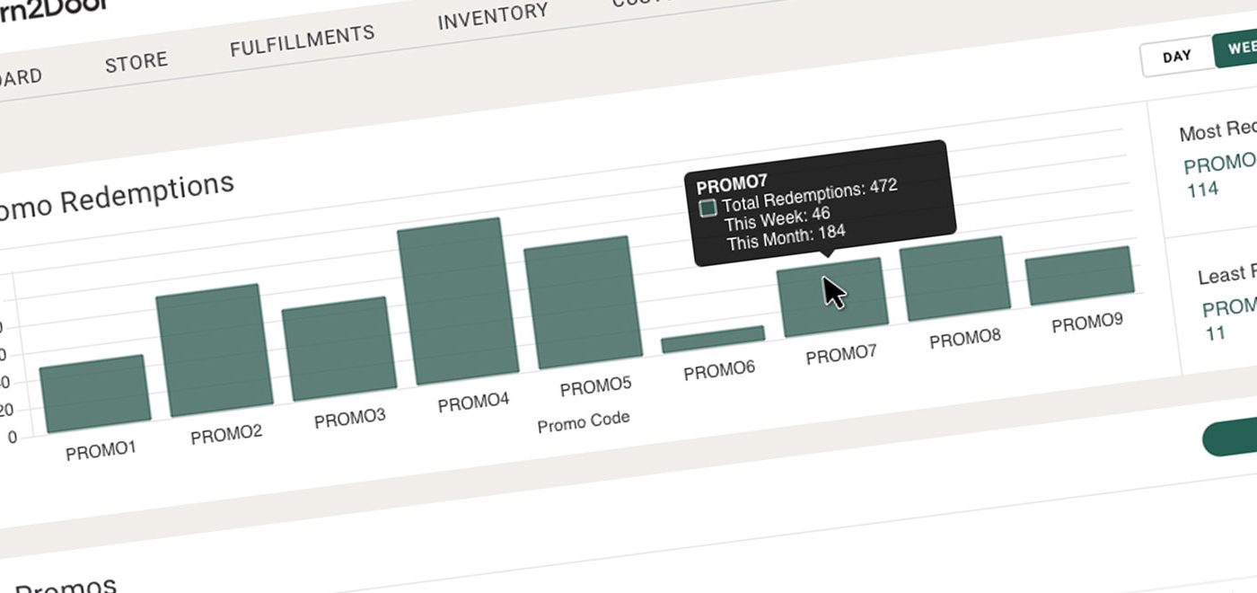
As you can see, there is no place here that easily displays redemption info. I saw it as a fun exercise to visualize what a solution to this problem might look like. What you see below is a possible solution on displaying this data. There’s a chart at the top which graphically displays the data so it’s easy to see at a glance. I’ve also added a “Redemptions” column and a Check Box column to the table below to display that info. The user can check or uncheck the boxes to choose what promos will display in the bar graph. They can also choose to view redemptions from the current day, week, or month.
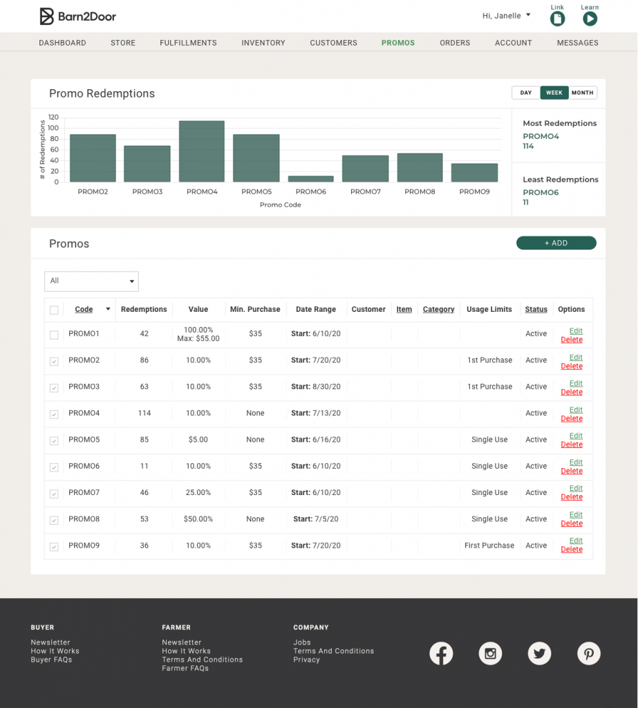
Furthermore, some other features that may work well on this would be to have more data appear as you hover over each bar in the graph, detailing each promo. To take this even a step further, when the user clicks on the bar, an overlay pops up that drills down even more giving the user even more data on that particular Promo Code.

